All You Need to Know About Parallax Scrolling

The first time I saw parallax scrolling on a website, to be very honest I mean how
The parallax scrolling in web design is a design practice in which the foreground of the website moves at a different pace than the background creating the illusion of a 3D effect. The images in the foreground and background are arranged in multiple layers and they move independently. The parallax scrolling in
To see parallax scrolling in action check
The parallax effect creates a unique and enjoyable experience to
Although the parallax effect does make a better user experience it is debatable if it improves the experience overall. When using a website with parallax, the entire attention of the user shifts to the effect, rather than the message the website is trying to convey. So parallax scrolling is not fitting for all kinds of websites especially
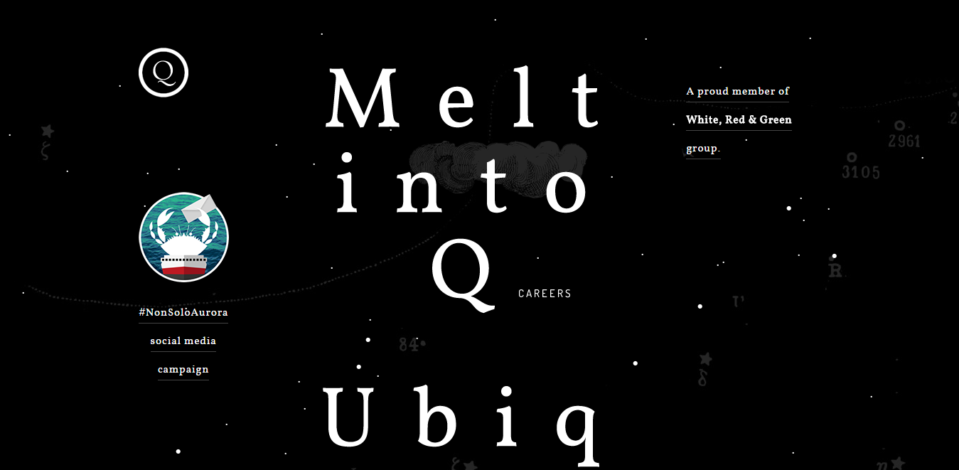
But still, this trend is seen in many websites including
Parallax effect has been used in
Parallax Scroll in 2017
The year 2017 has not seen any decrease in the popularity of parallax scrolling. There are still websites that are creating bigger and better sites with parallax scrolling.
At the beginning of the trend, the parallax effect was more of a scrolling effect in which the background of the website did not have many layers. But lately, in the year 2016 and 2017 websites have shown more clever and creative use of the effect to create a visual story-line .
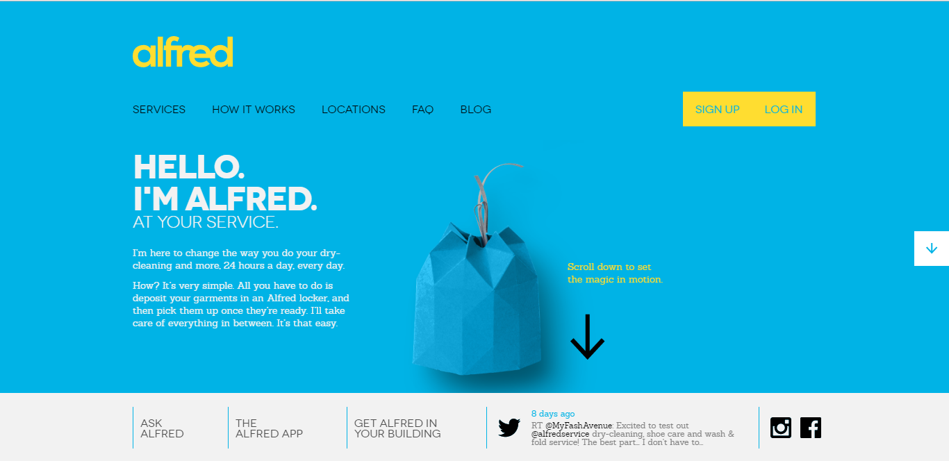
The website for Alfred is a great example.

Another clever usage of parallax is the effect created by the movement of the mouse where the movement of the mouse creates the 3D effect of the layers of the background.

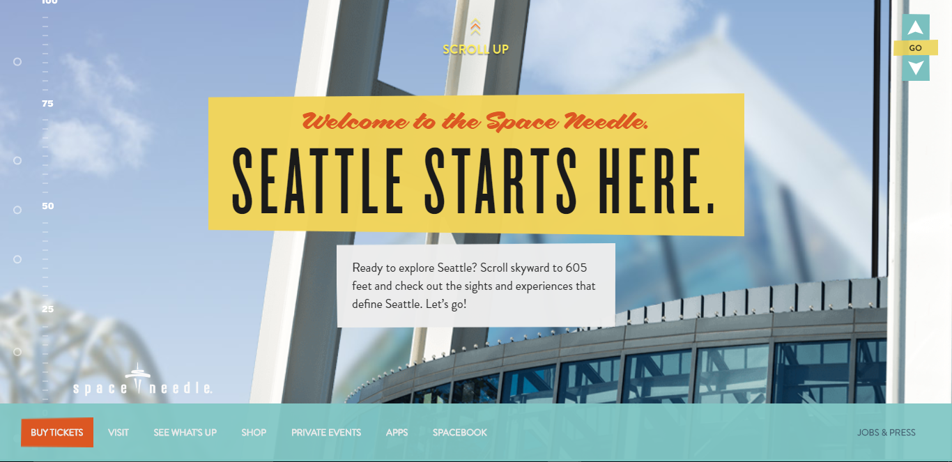
A creative example with upward scrolling is Space Needle .

The use of parallax scroll has increased immensely in this year also. What has changed is in the context that they are used, changes they incorporate, and stories that they tell.
Parallax scrolling is not for every website. Parallax scrolling is usually seen on websites with long scrolling content. It is best suited for single page website with only one page or for landing pages of websites.
Parallax Effects Isn't Always Good
Although the parallax effect increases the user interactivity, it has some downsides. Some of them are major ones that can be a deciding factor whether the parallax effect should be used on the website or not or how much of it should be used.
#1. Loading the site takes too long
In parallax scroll, the websites usually have one page, have all the images, videos and text in one single file. So the websites sometimes take too long to load. This is not good for the user and the business.
If the website takes too long to load, the user may not have the patience to wait that long and you will end up losing visitors. And your website will end up in a downward spiral in terms of visibility of your website.
#2. Not very good with the SEO
As mentioned, websites with parallax effect have a lot more content and thus can take a little too much time to load. When your website takes too much time to load, Google does not like it very much.
Since parallax websites have limited or a single page, there is not much keyword optimization that you can do. Also on such websites, the written content will be minimum for essentially one H1 tag, and one URL. This really affects the visibility of the website.
When the website is only one page, there is only one way to get to that page. There are no other internal linking or any other pages from where you can reach the website.
Recommended reading: Web Design Trends That Will Rule in 2018
#3 Can create a bad user experience
Parallax scrolling website mostly has long scrolling content and the content of the website that a user is looking for might be lying at the end of the website. The user would not like to scroll down to the end of the page to get what they want. They can give a link to the landing page that can scroll down quickly to the target, but it kind of gives you a seasick feeling. which does not make up a good user experience.
Conclusion
Parallax scrolling is used by the designers mostly for improving the aesthetics of the website and give the user amazed. But it comes with a price. Sometimes the websites lading time and a certain aspect of usability are compromised. But if using the parallax scrolling is worth those compromises, then why not make a masterpiece out of it.
Very informative and interesting for those who are interested in Parallax effects. Good work!
ReplyDeleteThumbs up for this great series that enables us to get to know about Parallax Scrolling.
ReplyDeleteThank you.
White Label Website Builder
Đặt vé máy bay tại Aivivu, tham khảo
ReplyDeleteVe may bay di My
lịch bay từ mỹ về việt nam hôm nay
vé máy bay từ hà nội vào nha trang
vé máy bay sài gòn phú quốc giá rẻ
vé máy bay đi huế vietnam airlines
MMORPG OYUNLAR
ReplyDeleteinstagram takipçi satın al
Tiktok Jeton Hilesi
tiktok jeton hilesi
saç ekimi antalya
Instagram takipçi
instagram takipçi satın al
Metin pvp
instagram takipçi satın al
smm panel
ReplyDeletesmm panel
İş ilanları
instagram takipçi satın al
hirdavatciburada.com
www.beyazesyateknikservisi.com.tr
servis
tiktok jeton hilesi
ümraniye toshiba klima servisi
ReplyDeletependik beko klima servisi
tuzla lg klima servisi
tuzla alarko carrier klima servisi
tuzla daikin klima servisi
çekmeköy toshiba klima servisi
ataşehir toshiba klima servisi
çekmeköy beko klima servisi
ataşehir beko klima servisi